How to use the candles chart
Our proprietary candlesticks charts are a staple for analyzing the price action and movements of a stock.
Streamlined Finance makes it possible to chart multiple assets in a single dashboard. Making it a really powerful feature.

Below your existing components, you can add your Candles Chart component. After you've selected the Candles Chart component, you will be prompted to select datasets.
Selecting Your Dataset
To select a dataset, you can search in the top search bar or click on one of the suggestions.
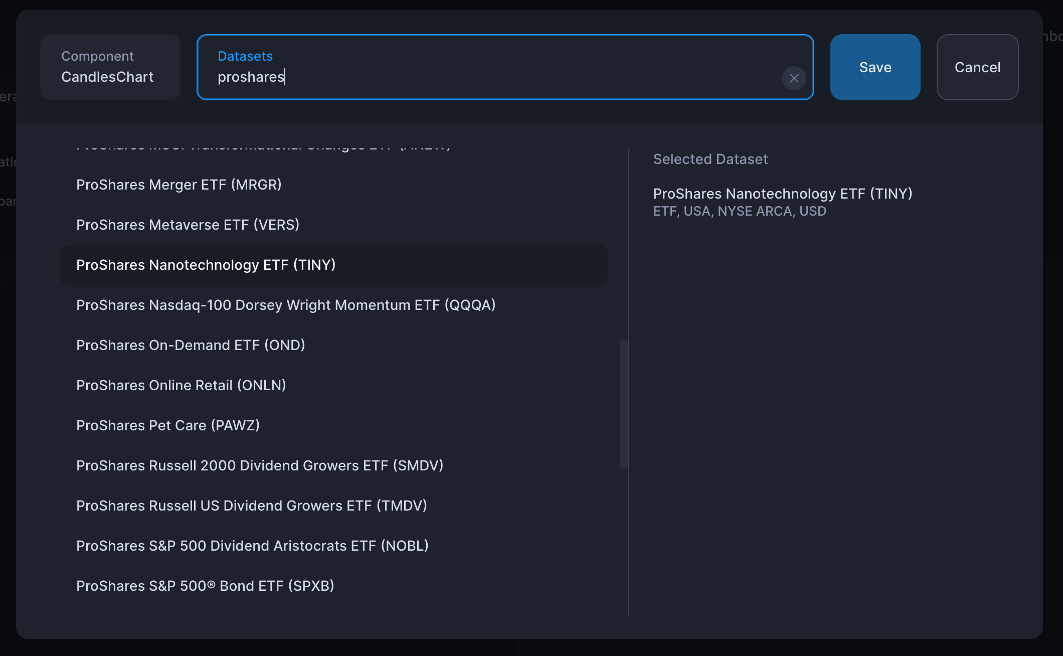
Once you are done, simply click save.
Selecting Timeframes
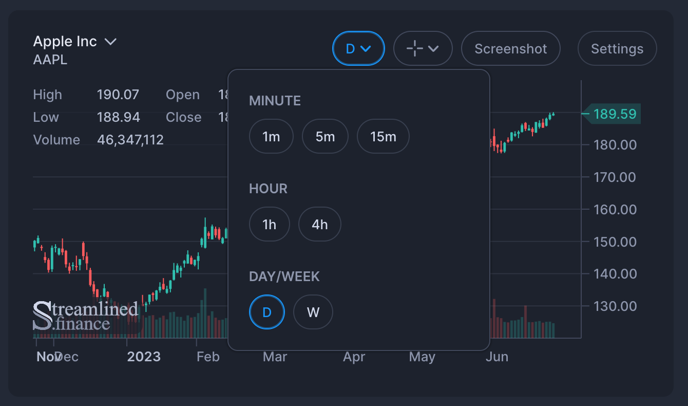
By default, the daily timeframe is selected, but you can change this by clicking on the timeframe button in the component's header.
Making Chart Drawings
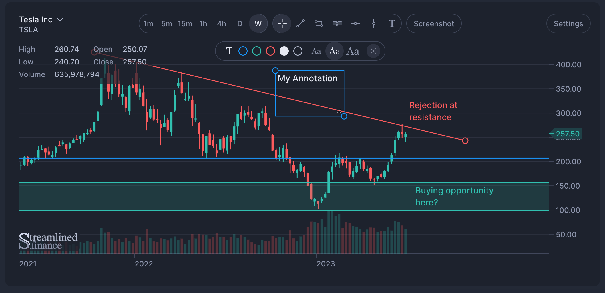
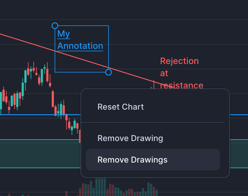
Fundamental to Technical Analysis is the ability to draw trend-lines, draw support and resistance zones and make annotations using text. Streamlined Finance makes all of this is possible using the tools available in the Candles Chart.
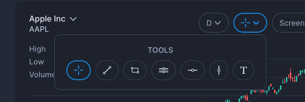
Once you have selected a drawing, a toolbar will pop-up that allows you to change color, change the size, or remove the drawing (using the "x" icon).
Zooming the Chart
Zooming the chart can be achieving in 3 different ways.
- Press cmd/ctrl and scroll to horizontally zoom
- Dragging the x-axis for horizontal zooming
- Dragging the y-axis for vertical zooming

Resizing the Chart
The chart will slightly change based on the size that you display it in.
For a big chart, we display full toolbars, making it a breeze to switch timeframes and add drawings.
And smaller charts will have the OHLCV information hidden.
Is the Price Realtime?
No, charts are delayed by 15 or 20mins.
Chart Indicators
Coming soon!