How to Analyze Stocks the Streamlined Way
One of the core tenants of Streamlined Finance is the ability to do fundamental analysis.
As an investor, it's vitally important to uncover and understand the business side of any stock that you're planning to invest in.
This is where our platform shines: welcome to Streamlined Finance.
We believe that anyone should invest with confidence. Investing with confidence happens when you've truly gained insight into how a company operates, its revenue & earnings, its profit margins, its growth rate and future projections and so forth.
Yes, the price of a company may go up or down, but if you've truly understood the business side along with its financials, you can be rest assured knowing that in the long run the market will uncover this same truth about the business, and as a result the market will eventually price the stock fairly.
Search for any Stock
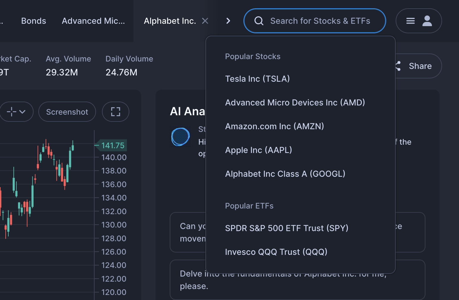
Using the search box located in the header (in the top right), you can search for any Stock or ETFs.
The Info Bar
Once you have selected any stock, you will see the stock's information in the top:
- Stock name
- Exchange info + Price status
- Price + Date
- Market Capitalization
- Avg. Volume
- Daily Volume
- Split Compare Button (more on that below)
- Share Button

The Streamlined Chart
The chart displays the prices in the form of candles (open low high close) to provide the most information. To learn more on candle sticks click here.
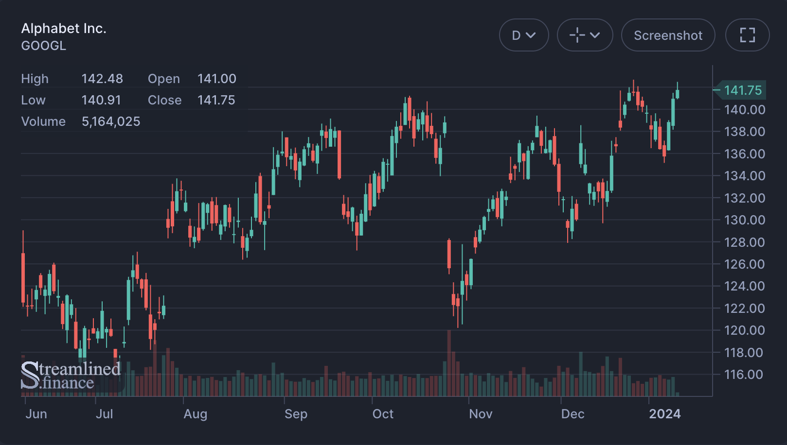
What's important to note is that the chart includes buttons in the top right. Using these buttons you can change the timeframe of each candle, access tools, make a screenshot and enter fullscreen mode.
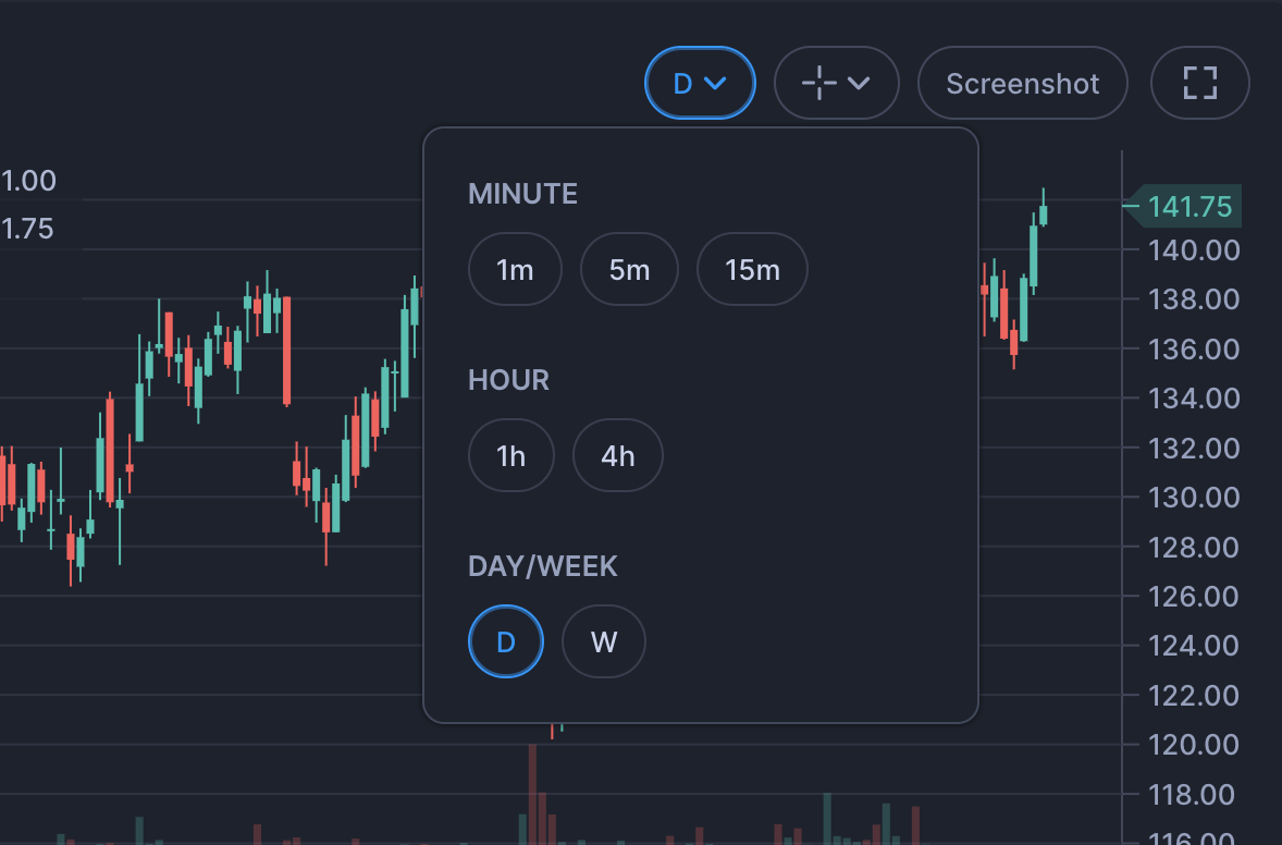
By default it's showing daily candles (D), but you can change this by clicking on the first button.
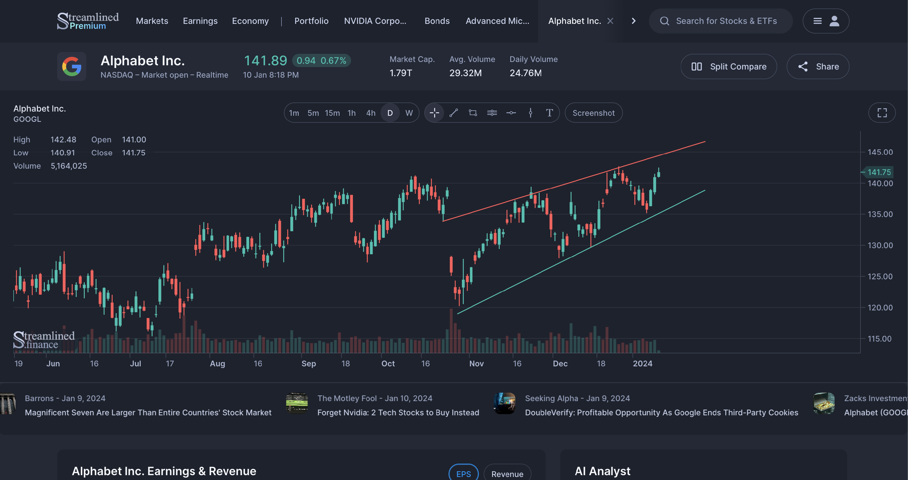
Next, you can also draw in the chart using the tools icon. This way you can do technical analysis by drawing trend-lines for example.

The screenshot button will save the chart into a .png image file.
Then, lastly you can set the chart to fullscreen mode:
The AI Analyst
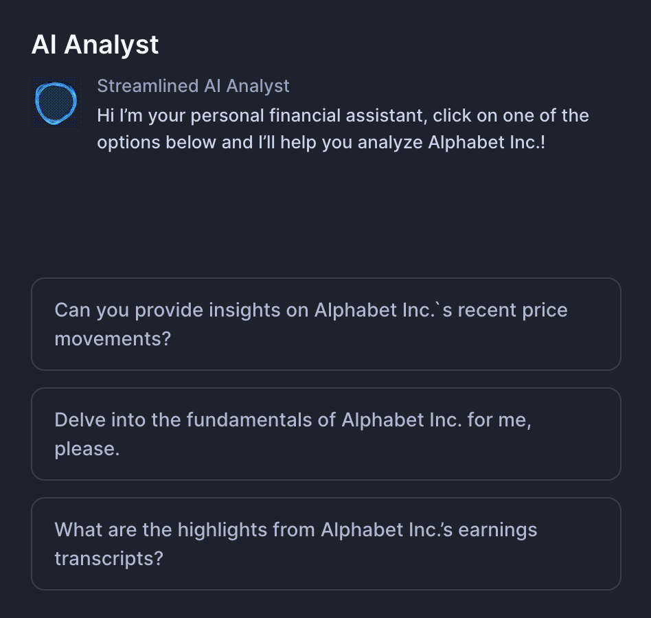
One of the novel ways to use Streamlined is by using the AI Analyst.
We're planning to expand its functionality, but currently it can help you by:
- Providing insights on recent price movements
- Delve into the fundamentals
- Summarize highlights from the latest earnings transcript
Earnings & Revenue
The Earnings (EPS or Earnings Per Share) & Revenue section provides a quick glance into the companies earnings, revenue and their growth rates.
You can switch the viewing mode between EPS (Earnings Per Share) & Revenue using the buttons in the top right.
The graph provides an easy way to see if the earnings (or revenue) are growing and their consistency. Each bar represent a quarter. The blue bar shows the actual result whereas the green bars show the estimates, which as you can see goes into the future.
Below the graph there's a slider that you can use to adjust the range.
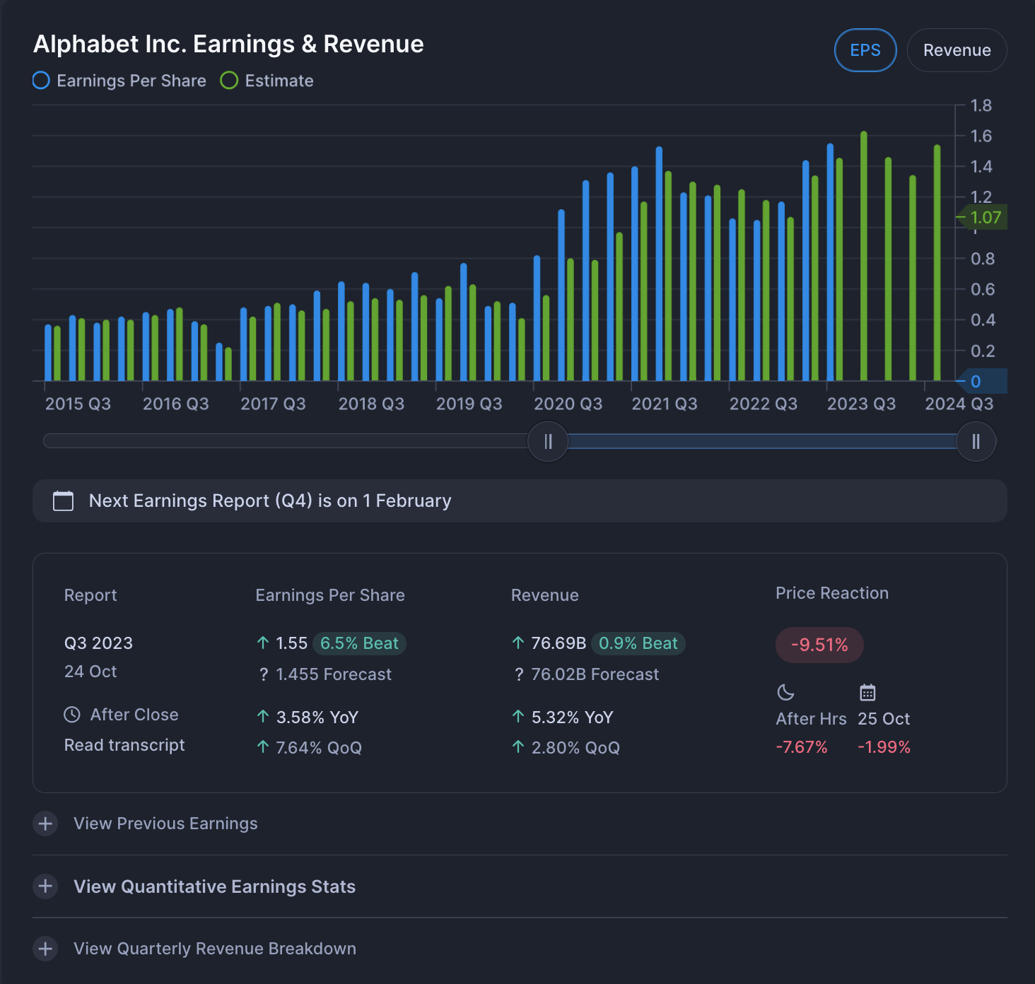
It also shows the date of thenext earnings report and information on the latest report. You can see the YoY (Trailing Twelve Months - Year over Year) and QoQ (Quarter over Quarter) changes for both Earnings Per Share and Revenue. Then on the right, you can see the Price Reaction of the earnings, which is further split into more granular segments (After Hours & Following Date).
Furthermore, you can view the previous earnings and Quantitative Statistics on its historical earnings.
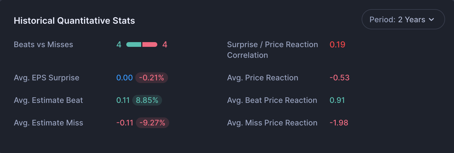
The Correlation between the earnings surprise (Beat or Miss) and their price reactions are in a linear mode, which means that if there was an upside surprise to the estimate (or beat) and there was a positive price reaction the value will be 1.
Income, Balance Sheet and Cashflow Sections
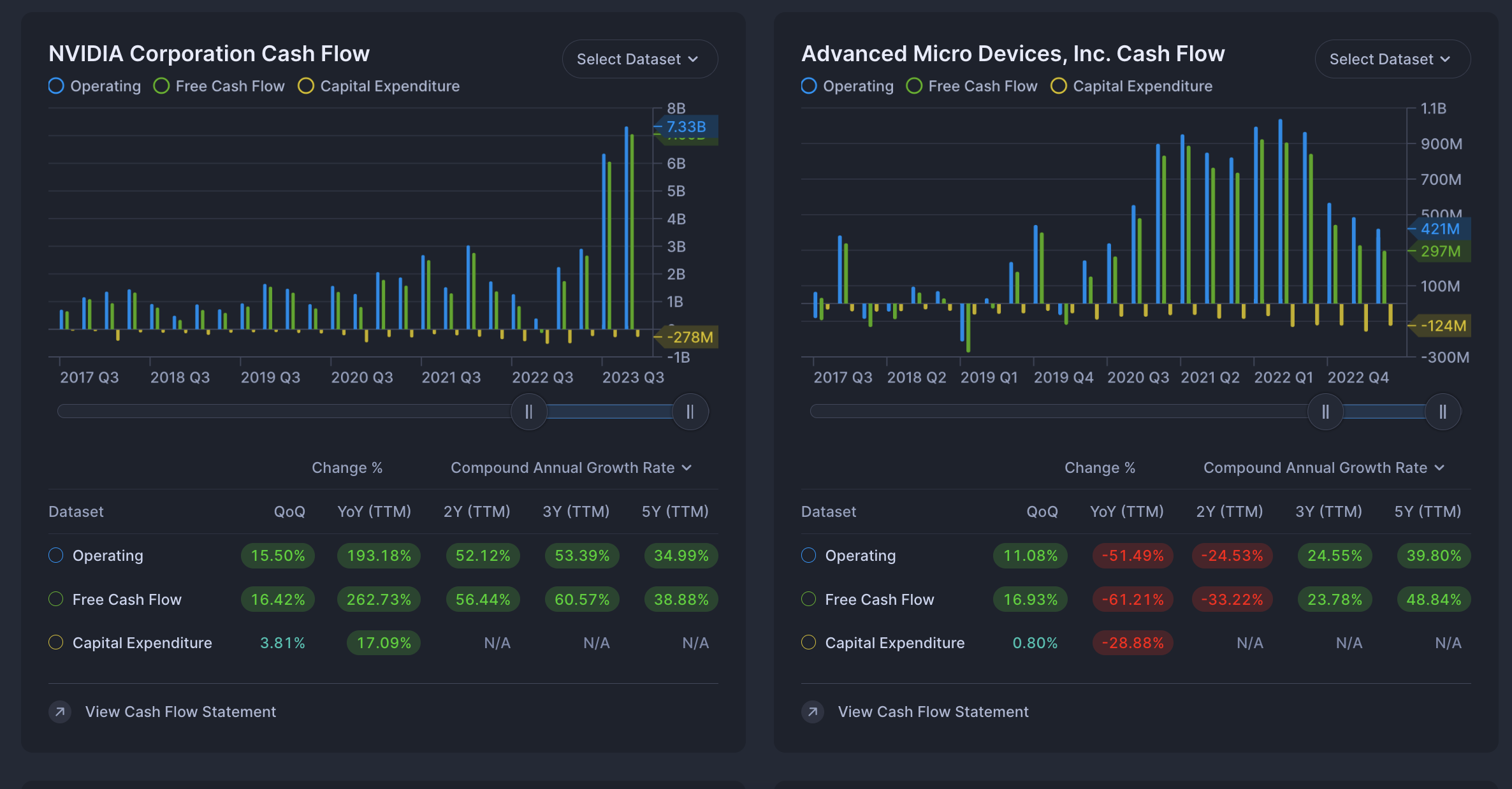
While these 3 sections have their differences in fundamental analysis, they are all the same in functionality.
You can select the datasets that you wish to display in the chart by clicking on the "Select Dataset" button in the top right. You can select multiple datasets to display and adjust the viewing range by using the slider below the graph.
In addition to the visual representation, you will find change percentages and growth rates below the graph in the table. You can select between Compound Annual Growth Rate and Average Annual Growth Rate.
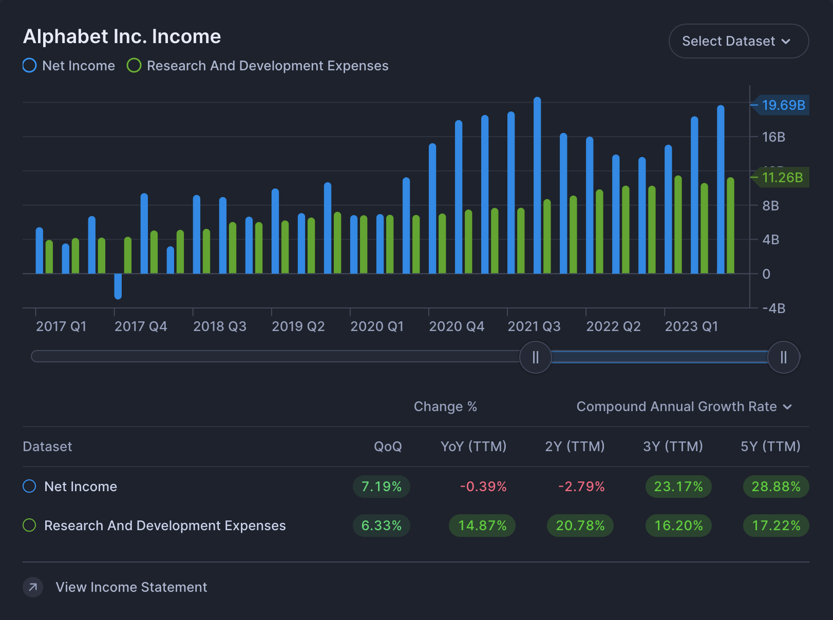
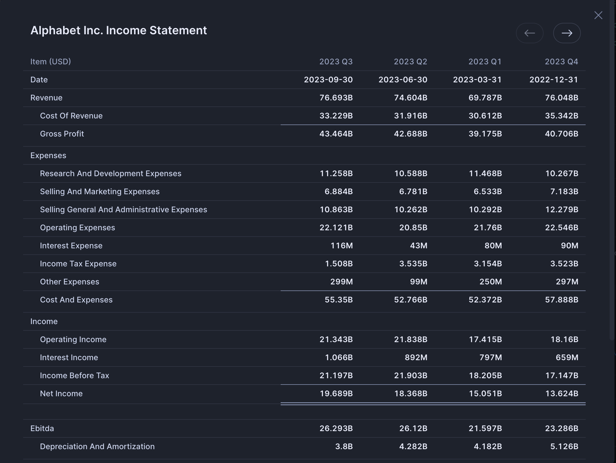
Lastly, at the bottom you can view the statement.
Financial Metrics
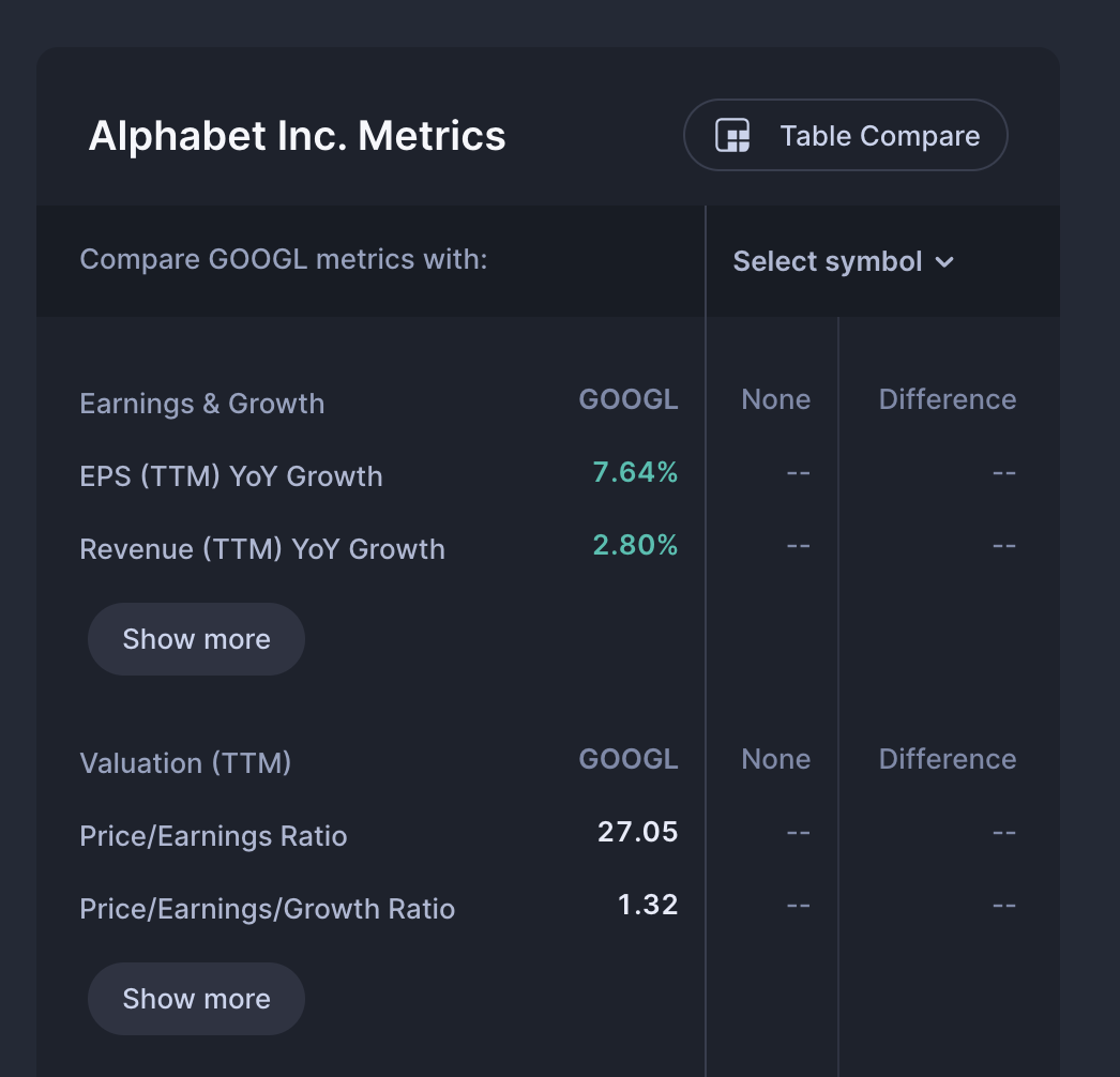
A stocks' financial metrics provide a great way to asses the company's growth rates, valuation and financial health.
Streamlined Finance categories the metrics and displays the most important ones for each category so that analyzing metrics becomes easy to consume. If you wish to delve deeper, you can do that by simply clicking the show more button below each category.
Comparing Metrics
What's more, if you wish to compare these metrics with another company you can do so by clicking the Select symbol dropdown.
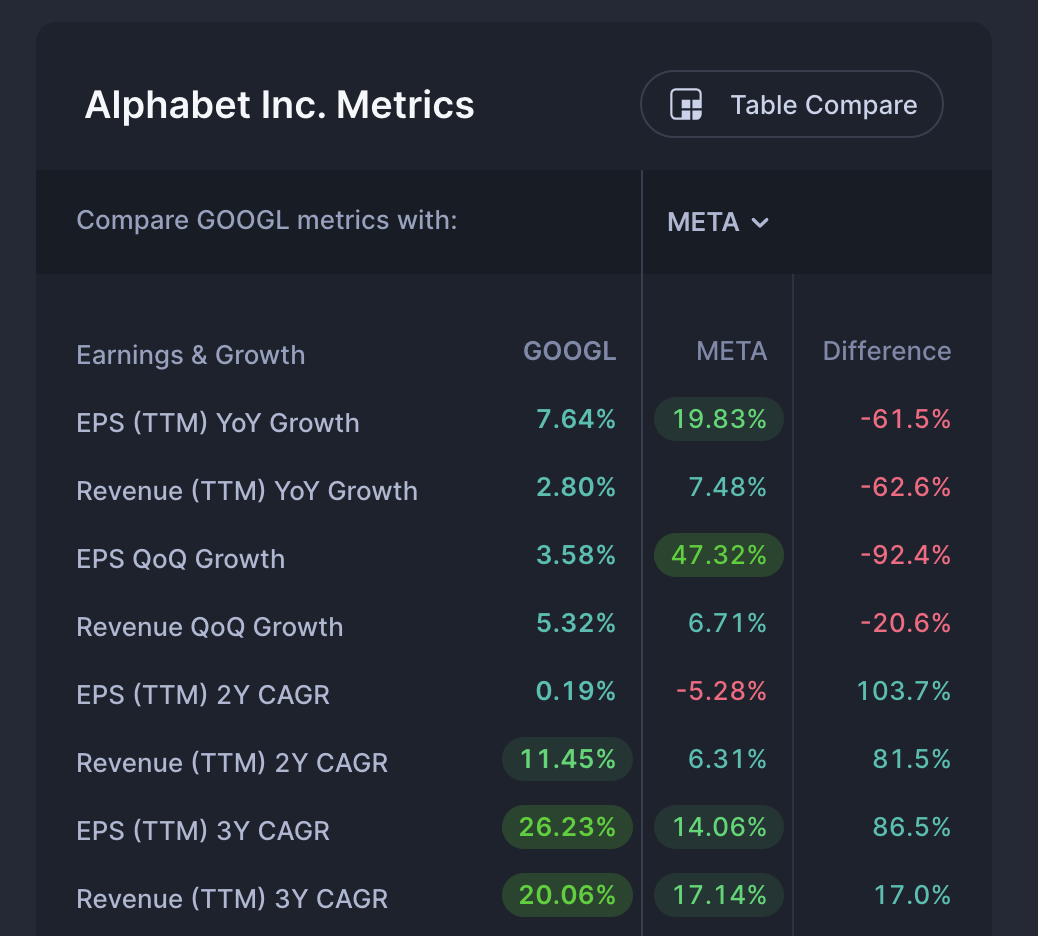
It's even possible to select multiple companies. In that case it takes the average of the selected stocks for each metric to compare.
In the last column, you will find the difference between the 2 columns. The difference is color coded and will respond differently for some metrics. For example a lower P/E ratio is positive for investors and as such will be shown in green, whereas a higher growth rate is positive and is shown in green.
Taking this one step further, there's an option to do this type of analysis in full screen mode by clicking on the "Table Compare" button.
Table Compare Metrics
Just like the financial metrics for a given stock, you can select other stocks to compare it with. If you wish to compare it to the average of multiple stocks, you can simply select multiple stocks for a given column.
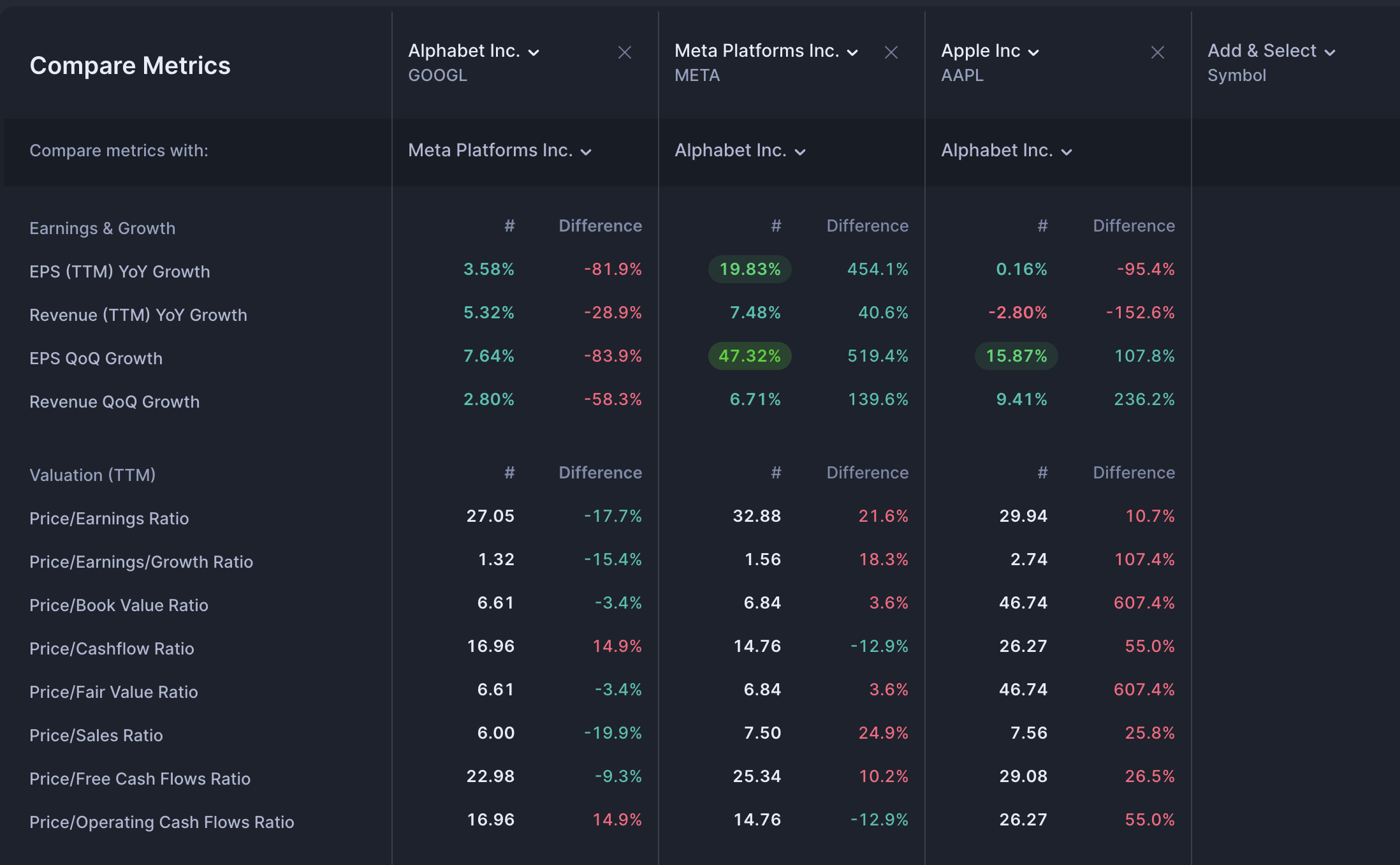
For each column, you may decide to compare it to a different stock. To make it convenient, you can also compare all columns to a selected stock by using the "Compare all with" option.
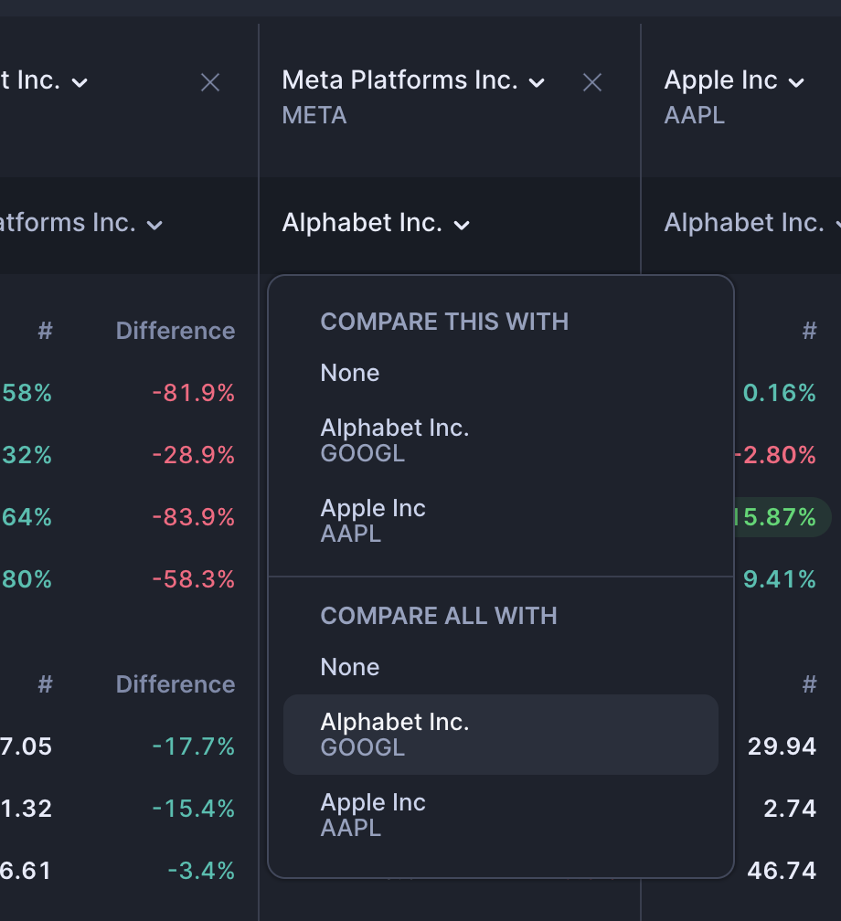
This is a really powerful feature to explore that can make it easy to compare different stocks of interest and to figure out which is the best one. You can really put them to the test!
Compare Side by Side
Streamlined Finance provides another way to compare stocks using the Split Compare button that you will find in the top right on any stock's dashboard.
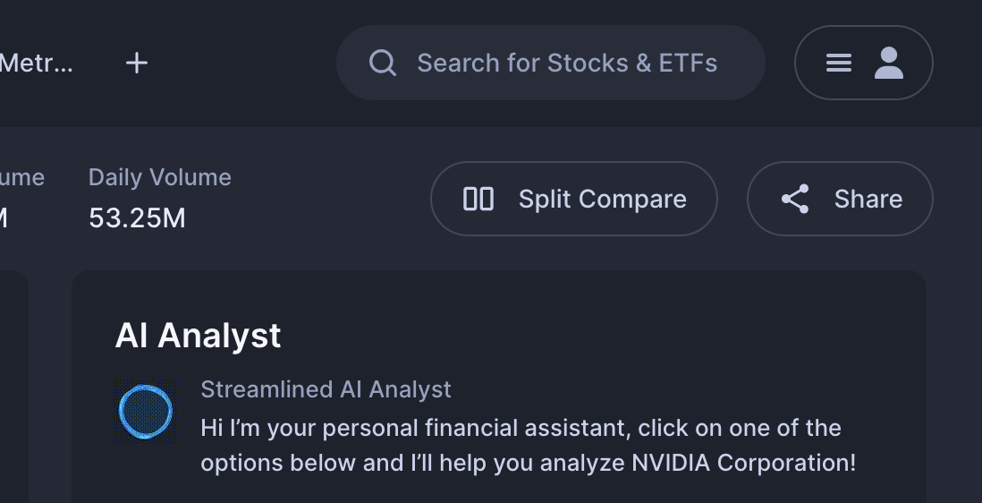
Once you click the "Split Compare" button you will be prompted to select the stock that you wish to compare the current stock to.
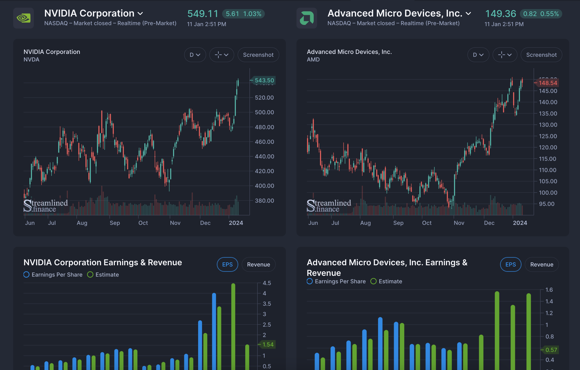
Now you can easily spot the differences in trends, variation and estimates for Earnings, Revenue, Income, Balance Sheet metrics and more.
The 2 sides are synced, which means that if you change the slider on one side, it will also do this for the other side, if you select datasets for one, it will also select it for the other side.
In Conclusion: The Streamlined Workflow
If you've read so far, you will have seen the various ways in which fundamental analysis is possible using Streamlined Finance.
The Streamlined way provides a comprehensive workflow to:
- Find stocks using the markets dashboard
- Analyze stocks using the symbols dashboard
- Compare stocks, either side-by-side or in a table form
If you wish to learn more on how to find stocks, please refer to the following article